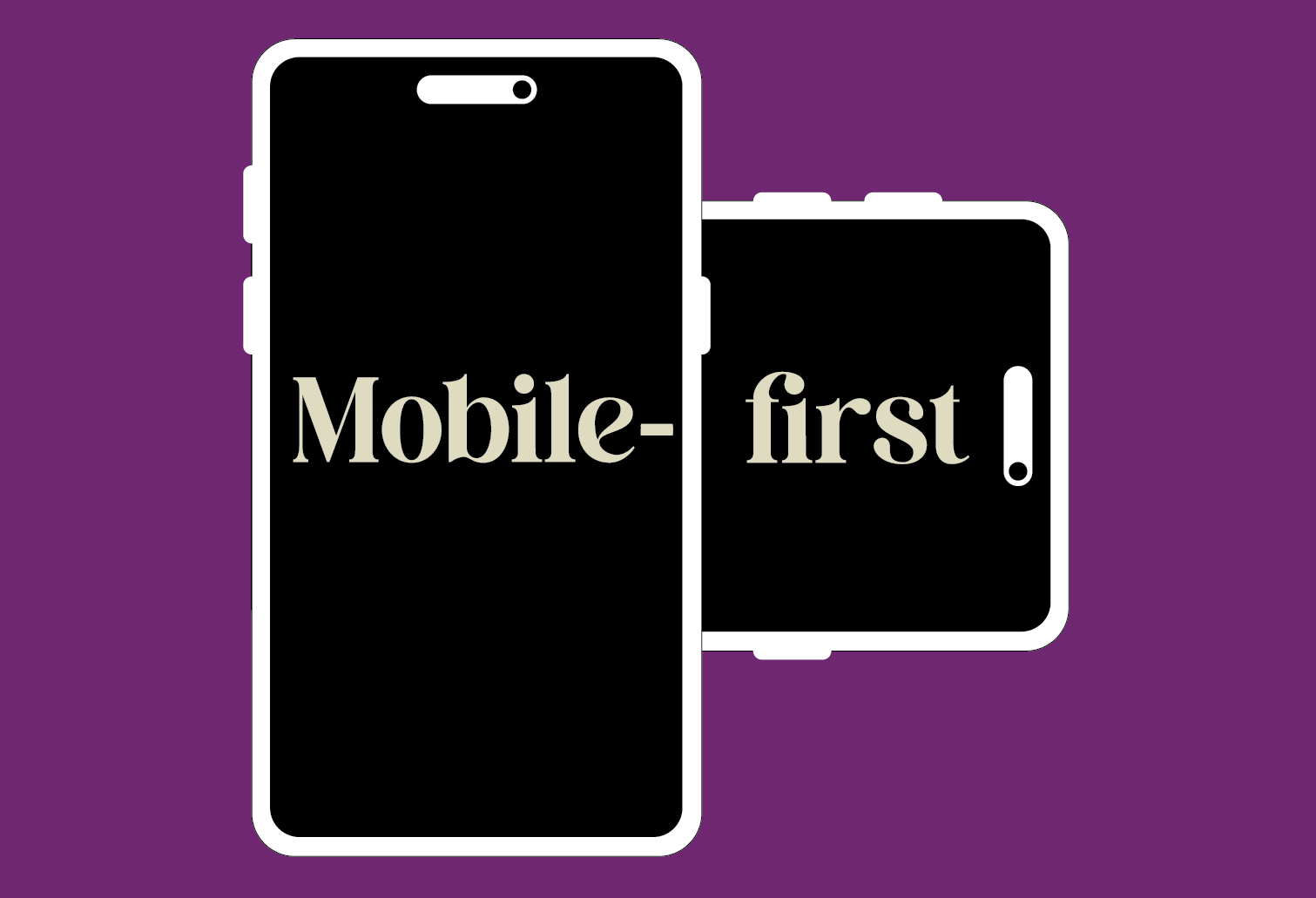
Why your website needs to be mobile-first – not just mobile-friendly
For years, having a “mobile-friendly” website was enough – meaning your site layout would adjust to suit smaller screens like phones and tablets. That was fine when most people browsed on desktops, but today, mobile-first design isn’t just a nice extra – it’s essential for user experience and Google search rankings.
Mobile-first vs Mobile-friendly
A traditional mobile-friendly website is designed for desktop, and then adjusted for smaller screens – resizing fonts, reducing images, and stacking elements vertically.
Mobile-first design turns this upside down: it’s designed for smartphones first – fast, simple and clear – and then enhanced for tablets and desktops. In other words, you start with the essentials (content, speed, clarity), and then layer-on extra design features for larger screens.
The result is cleaner code, faster load times, and a layout that feels natural on the device most people use.
Why Google now prioritises mobile-first sites
Google prioritises mobile-first sites because most people now browse the web on their phones. To give users the best possible experience, Google wants to rank websites that load quickly, are easy to read, and work smoothly on smaller screens.
To support this, Google now uses the mobile version of your website as the primary version for indexing and ranking. If the mobile version is slow, hard to navigate, or missing content, Google will assume the page offers a poorer experience – and rank it lower.
Why it matters for real people (not just Google)
Mobile-first isn’t just about search engines – it’s about the needs of the people who actually browse.
A mobile-first site ensures:
- Faster load times, even on slower connections
- Larger tap targets for buttons and links
- Readable text without zooming
- Simple, clutter-free navigation
- Optimised images that reduce data use
All of this adds up to a better overall experience – and happier users stay longer, engage more, and are more likely to become customers.
Does my site need a mobile-first update?
If your website was built more than a few years ago, it’s probably mobile-friendly but not truly mobile-first. You can check a few simple things:
- Does the site load quickly on a smartphone?
- Is all your desktop content visible on mobile?
- Do fonts and buttons resize without zooming?
- Is the design clean and easy to read on small screens?
If not, it may be time to consider an update. Moving to mobile-first doesn’t necessarily mean starting from scratch – it may just involve reworking styles, layout and performance to prioritise mobile users.
The payoff: better rankings, faster site, happier visitors
By switching to mobile-first, you’re aligning your website with how users and Google view it. It’s one of the simplest ways to:
- Improve search visibility (SEO) – Google is more likely to rank your site higher if the mobile version loads quickly and is easy to use.
- Lower bounce rates – visitors stay longer when pages load quickly, are easy to use, and stay stable while loading.
- Create a better experience – when your site feels smooth and clear, people are more likely to take action.
Need help assessing your website?
If you’re unsure whether your current site is genuinely mobile-first, we can run a quick mobile performance check. You’ll get a clear picture of what’s working, what could be improved – often without a full redesign.
Let’s help both Google and your visitors love your website on mobile. Call 3366 8166 or contact us to book a quick review or mobile-first update — it’s one of the most effective improvements you can make for both users and search engines.